ToursByLocal Website and Mobile Website Redesigning Concept
My team and I were tasked to select the website of an organization to evaluate and identify user challenges and solve a user need.
We selected Tours By Locals because it was an established tour operating platform, but the website at first glance looked outdated and exhibited some confusing features that piqued our interest for further investigation.
Designers in Team Box Turtles
Bianca Liu
Meenakshi Limbachiya
Carrie Ng
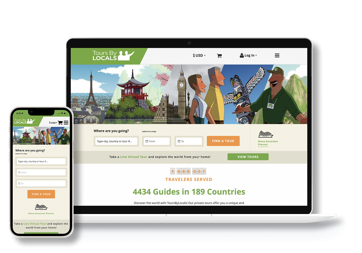
ToursByLocals Original Website
What is ToursByLocals?
TOURS BY LOCALS is a Canadian-based private tour provider. Since launching in 2008, it has grown to become a platform that hosts a network of 4700+ local guides working in 190 countries around the world.
Is this indeed still the promise? Let's take a look at what we discovered.
Design Process
1.Research - User Interviews
We planned and conducted 6 user interviews to understand the user type, journey, tasks, goals, needs, and most importantly, pain points.
Sample Questions
Tell me about a time that you used the service of a local tour guide.
What did you like about having a local tour guide?
Task
“Can you please show and tell me how you would book a tour guide for an upcoming trip to Tokyo using this website?”
We conducted interviews and created empathy maps to understand the users we were designed for and their needs of them. A primary user group identified through research was working travellers and enterprising adults looking for a good platform for tours and guides.
2.EMPATHIZE - PERSONA
Ryan is planning a trip with his parents for his Mom’s 60th birthday. His mom has always wanted to see Tokyo in Japan. This will also be the first time they have all visited Japan. Because it’s a special occasion, he thinks it would be a good idea to find a local tour guide to take them around for a day or two so they can have a more immersive experience with an experienced tour guide. Through a friend, he learns about this website and decides to start his research here.
3.DISCOVERY - USABILITY ASSESSMENT
When Ryan is searching for a tour guide, he is experiencing a myriad of challenges in the end-to-end flow of finding a tour guide
The website looks outdated and not very credible.
Can't effectively narrow down search results.
The filters are not effective.
There is no way to save a tour to review at a later time.
Fear of losing search results.
Overall experience was frustrating, making the user consider switching to competitors such as Airbnb.
SYNTHESIZE
We synthesized our findings from the interviews and task assessments, which revealed 5 problem areas of how users are affected in finding a tour guide
5 KEY PROBLEM AREAS
4.DEFINE - Problem Statment
Users want to take unique tours offered by local guides in their travel destinations but find the site frustrating to navigate, and visually overwhelming.
5.IDEATE - How Might We?
How can we help users easily find what they are looking for so they can plan their trips efficiently?
How do we reassure users they are using a credible and reliable site?
How can we help users find their ideal travel experiences and save, compare and share them with travel companions?
COMPETITIVE ANALYSIS + SKETCH
We looked to other similar tour provider platforms and conducted a competitive analysis to jump-start our ideation for each problem area
We interviewed 6 users about how they plan their travels and had them walk us through the Tours by Locals site as they searched for tours and this is what we found . . .
A. IDEATE ON THE SEARCH TOOL
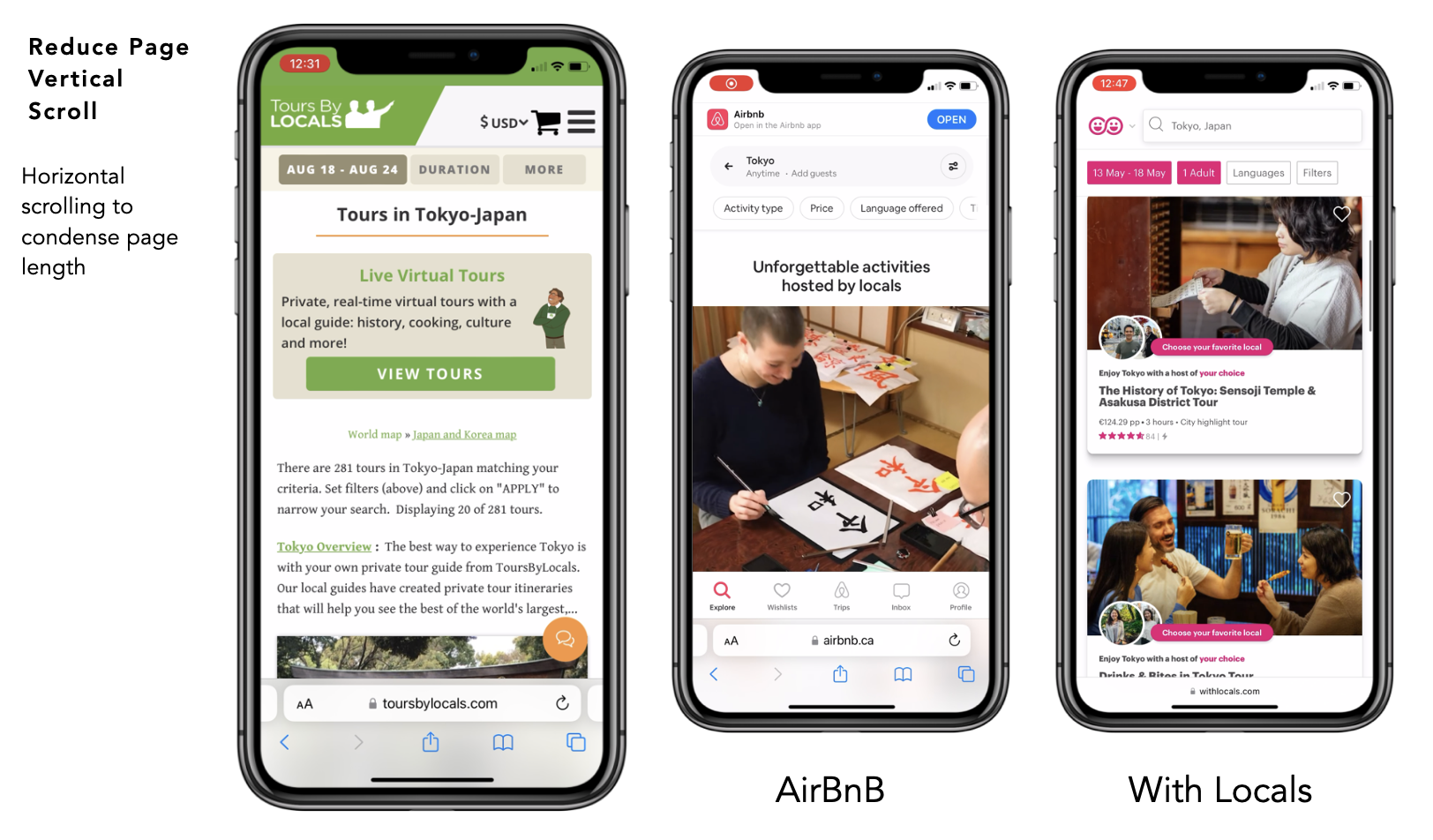
TOURS BY LOCALS - Users are lost and struggle to continue the next search because there is no visible search icon on the mobile or web interface.
COMPETITIVE ANALYSIS - Looking at Airbnb (top) and With Locals (bottom), the search tool is always visible, giving users the affordance to continuously search.
SKETCHING + IDEATING - We ideated how to make the search tool visible to the user so they can have a continuous search experience
B. OVERHAUL THE FILTER FEATURE DESIGN
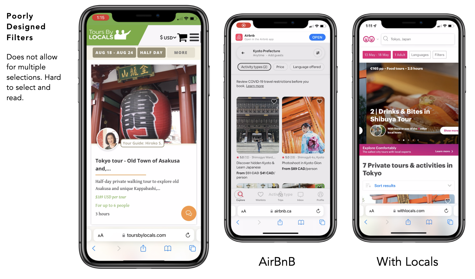
TOURS BY LOCALS - The filters are low contrast, hard to find and were an "either/or" selection, making it very limiting and frustrating for users to parse through search results.
COMPETITIVE ANALYSIS - Looking at the competitors, filters are high contrast and users are able to make multiple-choice selections to narrow down their search results.
SKETCHING + IDEATING - We ideated on the different placements and appearance of filters to increase contrast and on/off features to toggle search results.
C. ADD A MAP TO PROVIDE USERS WITH LOCATION CONTEXT
TOURS BY LOCALS - There is no interactive map on the tour description page. Users have no location context of where the tour starts and what is nearby.
COMPETITIVE ANALYSIS - Looking at the competitors, a map feature is available for users to visualize and learn about nearby attractions in relation to the tour.
SKETCHING + IDEATING - We redesigned the layout to incorporate a map so that users have a geographical context of the tour they are interested in.
D. HELP USERS SORT AND COMPARE THE TOURS THEY LIKE
TOURS BY LOCALS - There is no intermediary step for the user to save a tour to compare before committing to contacting a local tour guide.
COMPETITIVE ANALYSIS - On competitor platforms, users have the option to save a search so they can compare and review before committing to contacting the tour guide.
SKETCHING + IDEATING - We added the like and share button in tour listing cards and tour listing page, providing users with the intermediary step to plan and compare.
Competitive Analysis
We looked to other similar tour provider platforms and conducted a competitive analysis to jump-start our ideation for each problem area
6.Usability study
We ran a test with five users in our target demographic using the first iteration. There were a few complaints and suggestions, which helped us improve the user experience by creating a useful and pleasant product for our users. The design was well received by the participants, who found it simple to use.
The visual layout was more organized
Filters worked as expected
Ability to favourite, compare & share
Interactive maps are very helpful
The search bar is easy to find
7.High-fidelity
High-fidelity prototypes take you as close as possible to a true representation of what the user interface will look like. On these hifi screens, they were some minor changes that were made differently from the wireframe to better make the design more useful and seamless for the final user.
On these hifi screens, they were some minor changes that were made differently from the wireframe to better make the design more useful and seamless for the final user.
Style guide
We drafted our style guide to make our design elements consistent.
We chose Open Sans as our typeface due to its clean, minimalistic aesthetic and clear appearance.
Our brand colour is Green and Orange due to its warmness, attention-grabbing and energizing feel.
Prototype
On these hifi screens, they were some minor changes that were made differently from the wireframe to better make the design more useful and seamless for the final user.

Takeaways
What I learned from this design project was that when confronted with a website that needed so many improvements, it can be challenging to focus on where to start.
Remembering that we are not our users, and listening and observing what the users need to complete their tasks helped us to hone in on what features are need-to-haves vs. nice-to-haves.
Using interaction design principles as the anchoring strategy helped us break through the noise and chaos of the layout and typography to produce a cleaner, more modern design in this 3-week design sprint.


